

Search Website
Accessible Documents
Overview
Accessible documents are designed so that people with a range of ways of perceiving, navigating, reading, and processing information can access and use their content independently. Making a document accessible requires consideration of both the information itself and how that information is structured and presented. The techniques provided here can apply to many forms of digital documents, including Word Documents and PDFs.
Rationale
Making a document accessible ensures that a wider range of users, including users who use assistive technologies (e.g.: screen readers), can access the information in the document independently and effectively. It can also reduce the need for users to request alternative formats or additional accommodations.
Guidance
Accessible document design means making intentional choices about how information is structured, organized, written, and presented. Different tools for authoring documents (e.g. Word or PDF) may offer different tools and steps for supporting accessible design, but the guidance provided here highlights practices that can be applied across different types of digital documents.
Use a clear document structure
Organize the document so that its purpose and structure are easy to understand. Break longer documents into meaningful sections and use consistent formatting to show how information is related. Use clear and descriptive section headings and use built-in heading styles to format headings. Otherwise, a screen reader cannot distinguish between headers and regular text, making it more difficult for the person to navigate different elements of the document.
Document styles have 2 components:
- Visual settings (font, colour, font size, etc.)
- An invisible tag to indicate the structure/hierarchy of an element. This is used by screen readers to support ease of navigation and by text editors to identify sections of a document
Below is an example of distinct styles for Headings, Subheadings, and the body of text in a Word document. Make sure to use consistent styles for headings, sub-headings, and the body of your documents. Using styles appropriately ensures that assistive technologies can identify heading levels and improve the navigability of the resource.
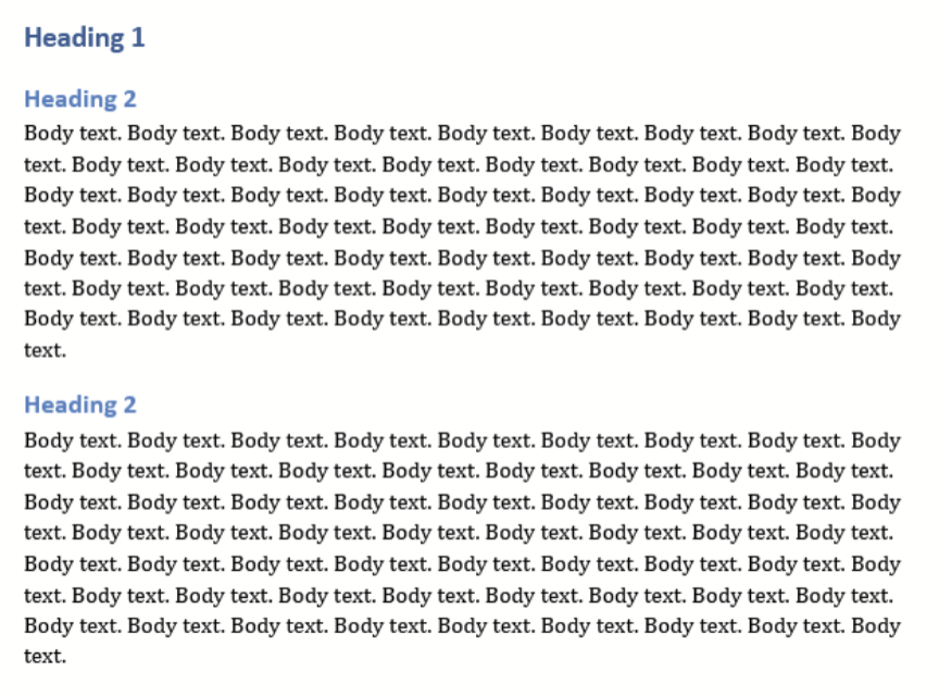
For more information on how to apply this in Microsoft Word, see Microsoft’s guide on how to customize or create unique styles.
Use tables appropriately
Tables can be useful tools for organizing data and showing relationships between pieces of information, but complex or poorly structured tables can introduce readability and navigation issues.
Use tables for organizing structured data into tables and rows when that organization is helpful for understanding the data. For example, organizing workshops by date and location.
|
Workshop |
Date |
Location |
|
Introduction to Accessibility |
October 31st, 2025 |
Online |
|
Navigating Digital Accessibility Guidelines |
November 13th, 2025 |
Room 251 |
|
Writing Alt Text |
November 17th, 2025 |
Online |
|
Crafting an Access Statement |
November 28th, 2025 |
Online |
Do not use tables to control the visual layout of page elements. For example, tables should not be used solely to position images and text together:
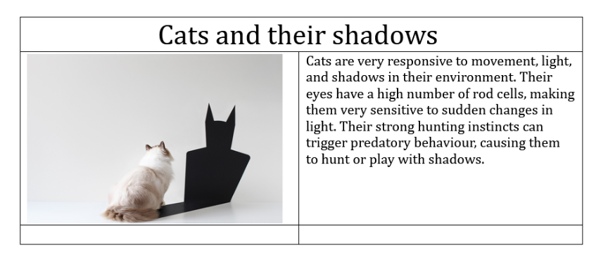
When tables are used to control the layout of page elements, assistive technology may encounter unnecessary table structures, empty cells, or content in an unexpected or confusing read order.
If you do use tables, keep tables simple and use proper formatting to improve readability and support navigation via assistive devices. This includes:
- Ensuring that columns are properly labelled using header rows
- Avoiding using merged or split cells
For more information on creating accessible tables in Microsoft Word, see Microsoft’s tips on creating accessible tables in Word.
Use accessible text formatting
Text formatting can affect how easily information can be perceived and navigated. Use text formatting consistently throughout your document to improve readability.
- Use accessible fonts and accessible colours.
- Ensure that links are visually identifiable (for example, through underlining)
- Use descriptive link text that tells users where the link leads or what they will find there. For example, See this guide for creating or editing a hyperlink rather than"Click here".
Provide alternatives for visual information
Visuals can be an important source of information, but essential information communicated through an image, graphic, chart, or other visual should also be communicated in another way. This might mean explaining essential information contained within complex graphics in the body of the text or ensuring that alt text is included for meaningful images.
Ensure a logical reading order
The reading order of a document determines the order in which elements in the document are encountered when using an assistive technology, such as a screen reader. A logical reading order helps ensure that information is presented in a sequence that makes sense to the user when the document is navigated non-visually.
Reading order for a text-only document typically follows the order in which the content appears. For example, for an English text, the read order is normally left-to-right and top-to-bottom. The reading order becomes more complicated when a document contains other elements, such as images, tables, charts, or other content that may interrupt the flow of text.
To ensure logical reading order:
- Arrange the content in a logical sequence
- Keep images and other objects in line with text where possible; Microsoft Word treats inline objects as part of the normal text flow.
- Avoid using floating items, such as text boxes, floating images, or other unnecessarily complex layouts
- Ensure that captions and explanatory texts are positioned logically with the content they describe
Using accessibility checkers
Accessibility checkers, like those available in Microsoft Word or in Brightspace, are built-in tools that check digital documents for common accessibility issues and often offer suggestions on how to resolve them. They can be a useful guide for identifying potential accessibility problems. However, accessibility checkers do not identify every possible barrier. For example, an accessibility checker could flag if an image is missing alt text, but it cannot evaluate the quality and accuracy of alt text on images.
For this reason, accessibility checkers should be used as part of your accessibility review process, but not as a replacement for human judgement.
For more information on accessibility tools in common platforms, see Microsoft’s guide to Improve accessibility with the Accessibility Checker and the OWL Brightspace Pro Tip on Using the Accessibility Checker.
Creating an accessible PDF
To create an accessible PDF, start with an accessible Word Doc by following the tips above or an accessible presentation by following the tips available in the Accessible Presentations Strategy. Use "Save as PDF" or “Export to PDF” to generate the PDF and ensure accessibility or document structure tagging is enabled. Avoid printing to PDF, as this often removes accessibility information.
Resources
Government of Canada. (n.d.) Create document. Digital Accessibility Toolkit. https://a11y.canada.ca/en/accessible-word-documents-in-microsoft-365/
Council of Ontario Universities. (n.d.) Using Word Documents and/or PDFs. Educator’s Accessibility Toolkit. https://accessiblecampus.ca/tools-resources/educators-tool-kit/teaching-tips/using-word-documents-andor-pdfs/